-
Improvement
-
Resolution: Obsolete
-
 Neutral
-
None
-
None
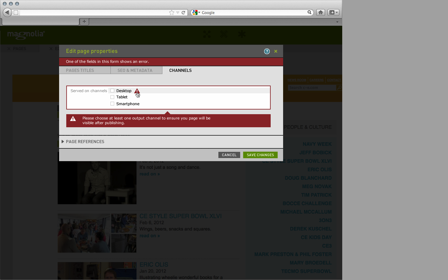
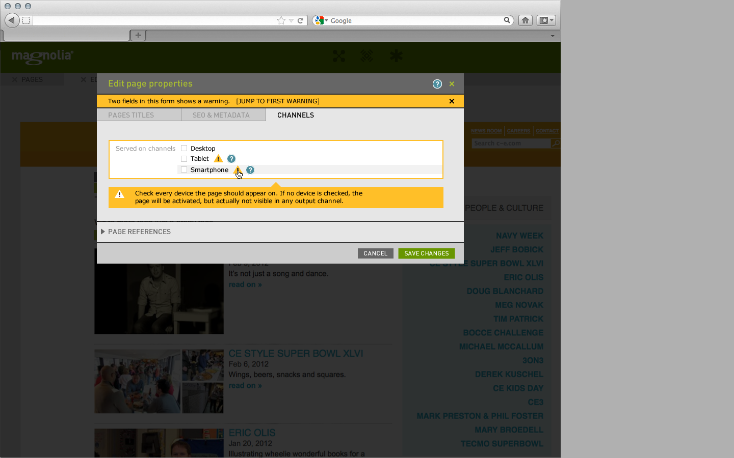
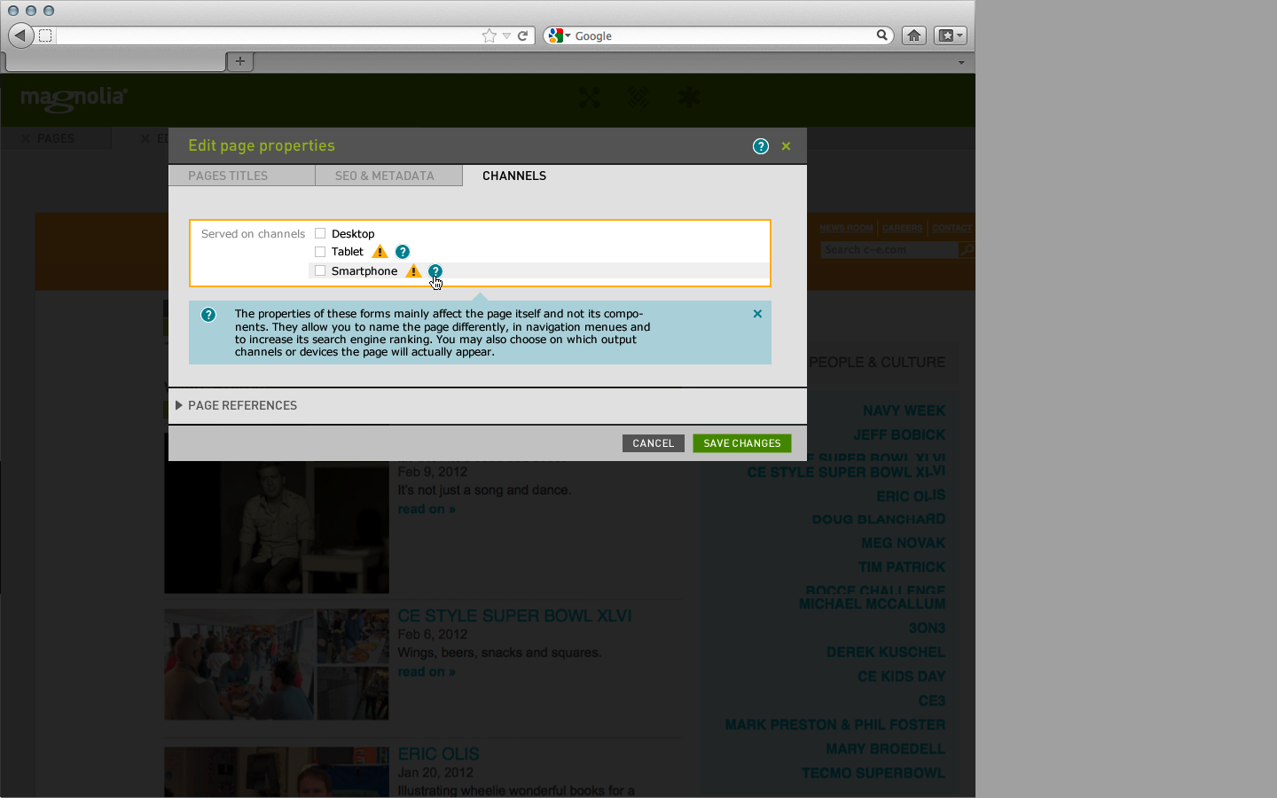
In forms, the in-line help and validation messages currently look too blocky. They extend to the full width of the dialog, but were actually designed to be only as wide as the right part of the form covered by the input fields. Also, the inline message are too high and their paddings are too large.
As one result of this, error and warning messages look way too alarming. It also seems that full-width validation messages stand in the way of fixing properly layed-out multi-line labels.
The original visual design of these messages asks for a more subtle appearance. I've added a set of sub tasks to this issue which describe the detailed changes I'd like to make.
- is depended upon by
-
-

- Closed
-
1.
|
Tweak how we show warnings and errors in input fields |
|
Closed | Unassigned |
2.
|
Change help and validation messages in forms to look less blocky and alarming |
|
Closed | Unassigned |
3.
|
Change the main message banner in forms to appear less bulky |
|
Closed | Unassigned |