-
Sub-task
-
Resolution: Fixed
-
 Neutral
-
None
-
EE-pro webapp of 5.4.4-SNAPSHOT: https://jenkins.magnolia-cms.com/job/ee_bundle/4462
-
-
Basel 25
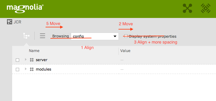
The view options (the workspace switcher and the filter checkbox) need five visual nudges to look better.
Please do the following:
- Workspace switcher: align the label with the text of the value in the label. The label looks properly positioned in regard to the view switchers on the left. I'd thus move up the combobox one or two pixels, until the text is aligned.
- Increase the whitespace between the workspace switcher and the checkbox. The two are too close together. Try a horizontal padding 1.5x the current one.
- Align the value of the label and the checkbox. They should be vertically centered here.
- The label is too close to the checkbox: try to double that horizontal padding.
- Increase the distance between the "list" view selector and the workspace switcher; the two ar e too close together. Try a horizontal padding 1.5x the current one.