-
Improvement
-
Resolution: Fixed
-
 Major
Major
-
None
-
None
-
-
Empty show more show less
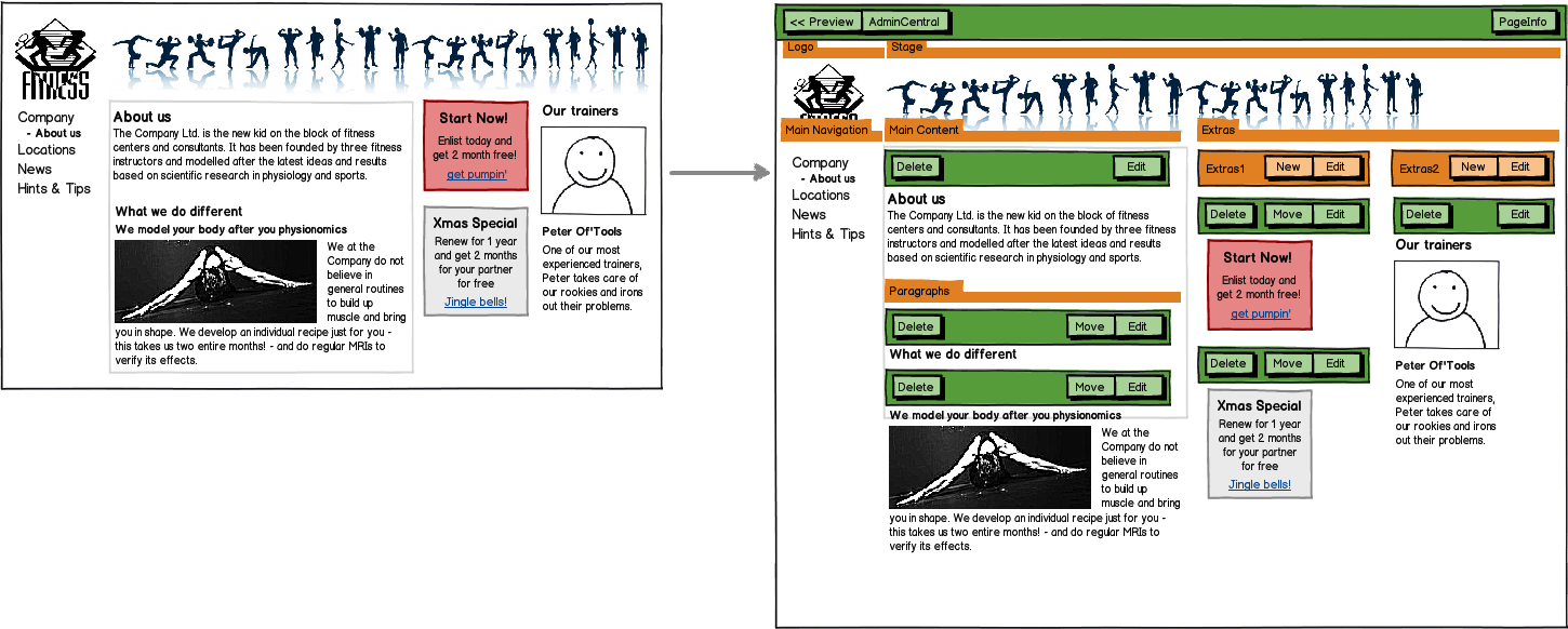
The new concept of Area edit bars and the demise of the New bar requires some changes to how edit bars look and behave.
The current problems are:
- a single component area is represented by only one (area) edit bar, which reduces visual noise, but also requires tricks and special handling of buttons
- the overall appearance is inconsistent (e.g. the "edit" button is on the right side for areas, on the left for "components")
- bars are sometimes rendered before their elements, sometimes below (breadcrumb) or above it (page edit bar). Apart from inconsistencies, this may cover clickable content.
- button names are long ("edit component", "add component")
- buttons could be labeled more consistently and in-line with current Magnolia (e.g. using the "New" for adding a component).
- bars of areas, especially of top-level areas, seem to be frequently "in the way" in the sense that you have to show them although they are only of reduced interest to a typical editor
In addition, we can already prepare for Magnolia 5 by introducing some changes now (e.g. moving the "edit" button on the right and using a different color for area edit bars).
This issue basically introduces the following main changes:
- all area edit bars work the same, whether they have no, one or n components
- all edit bars except top-level area bars are rendered in-line and non transparent
- non-editable area bars are rendered using a reduced bar
- top-level area bars are hovering above content and are rendered using a reduced bar
- area edit bars use a color other than light blue
- some consistency changes for button names and positions
Acceptance criteria
There are no Sub-Tasks for this issue.