-
Improvement
-
Resolution: Fixed
-
 Neutral
-
4.4.1
-
None
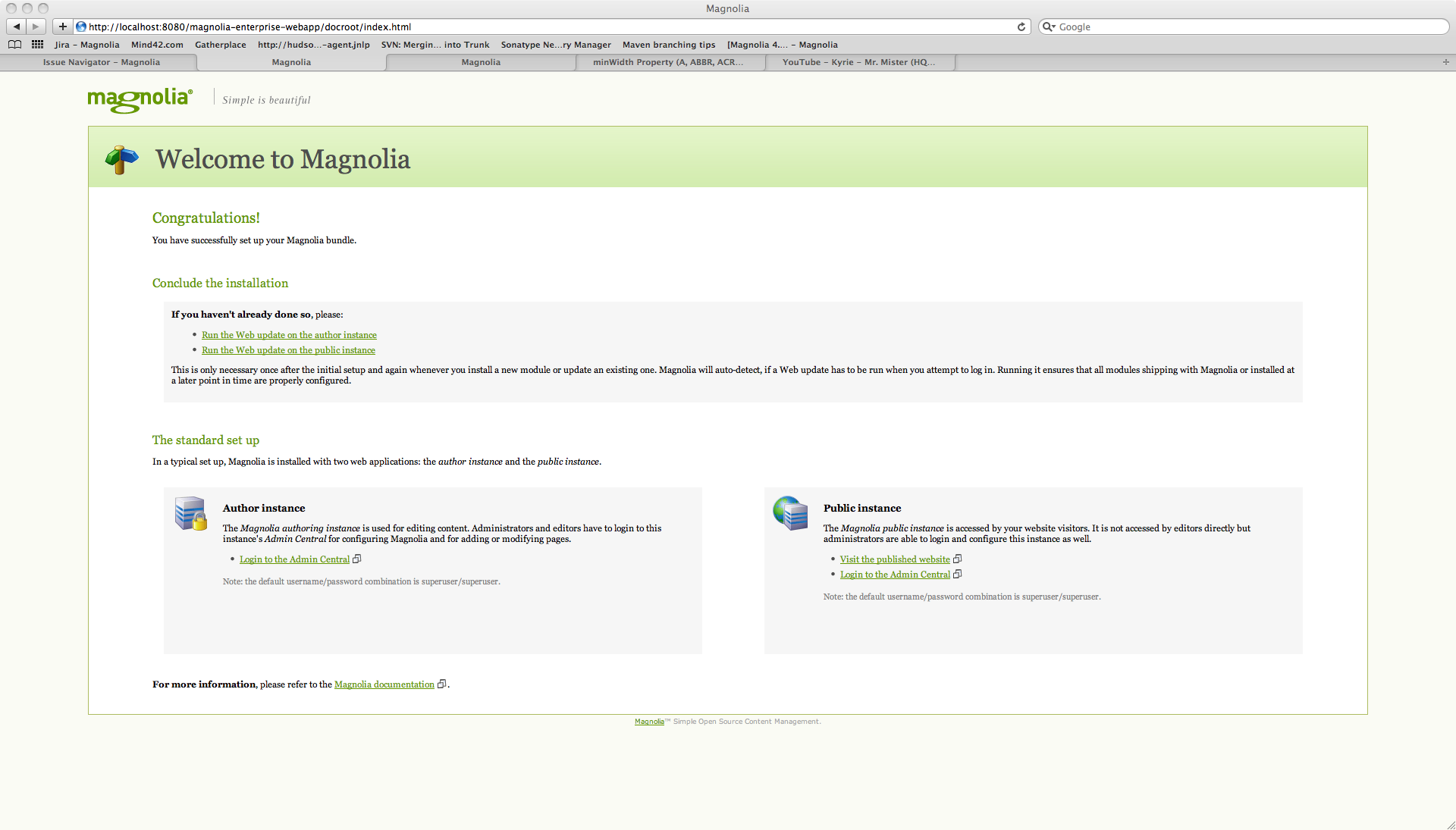
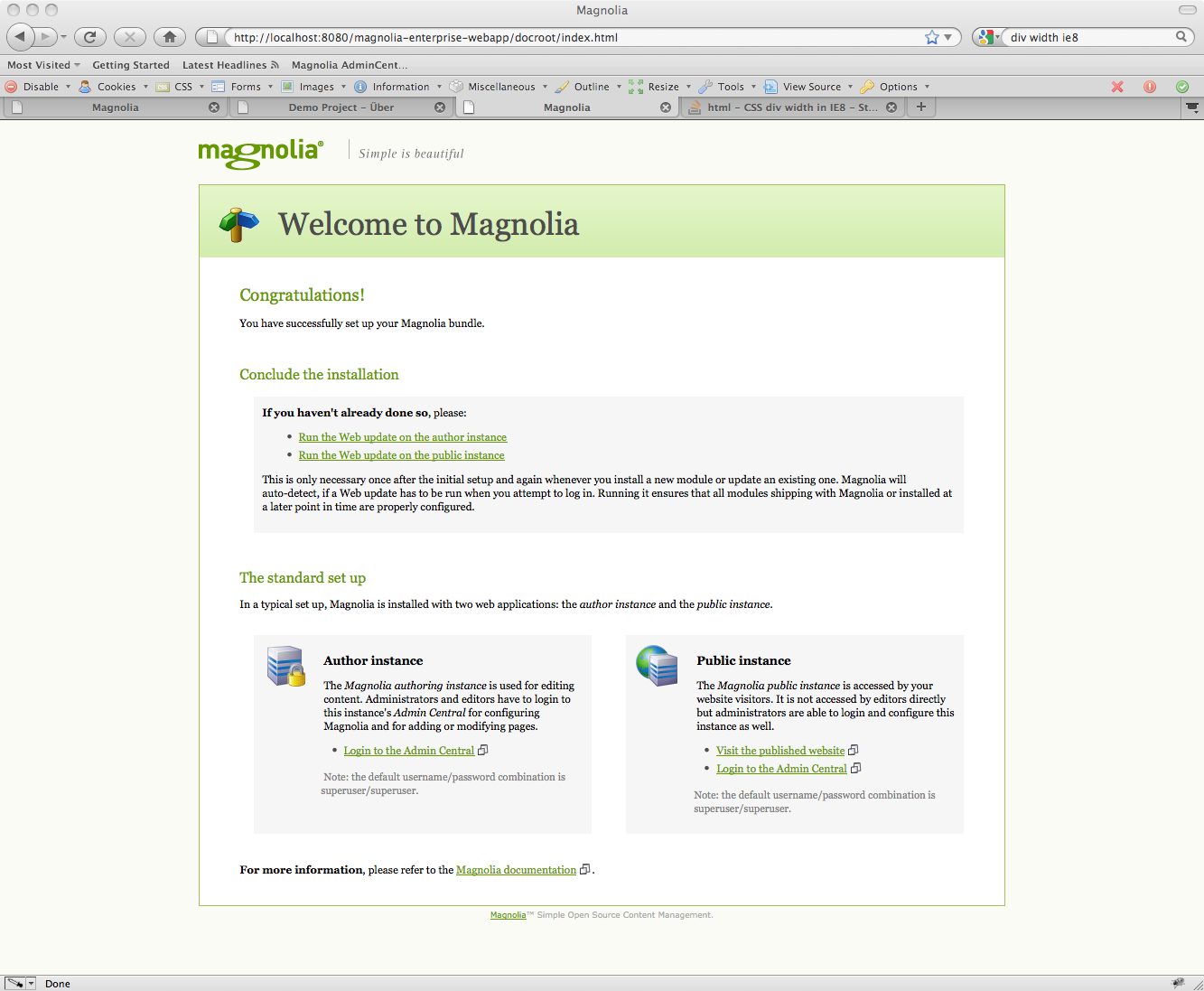
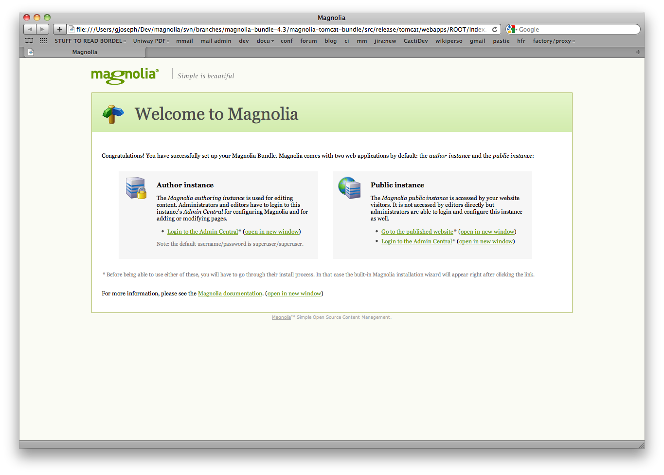
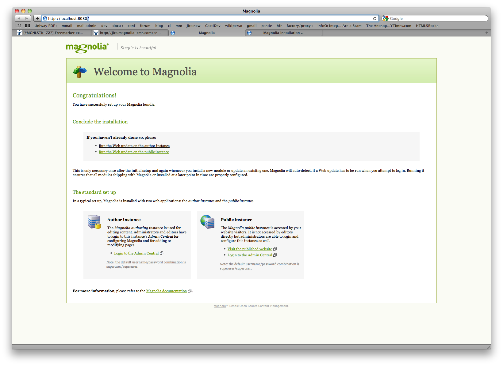
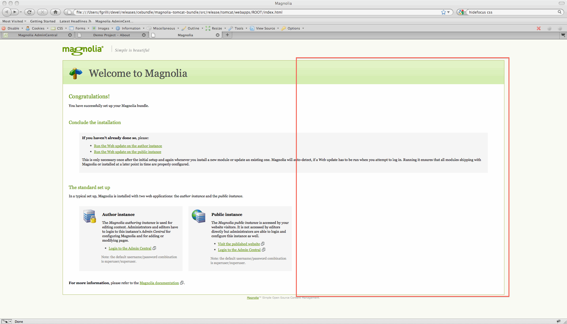
Regarding the changes from screen#4 in MAGNOLIA-3387, I have the feeling that
- the additional text on the ROOT page is useful (i.e provides useful information for newcomers), but ...
- the layout of the page looks "broken", the text seems to be floating at random and the color of the first link is black (possibly because it's :visited, but I wonder why the second occurrence of the same url is still green, then)
- i have the feeling users will first go for links/icons before reading the fine print anyway ?
Acceptance criteria