-
Improvement
-
Resolution: Unresolved
-
 Neutral
-
None
-
None
-
None
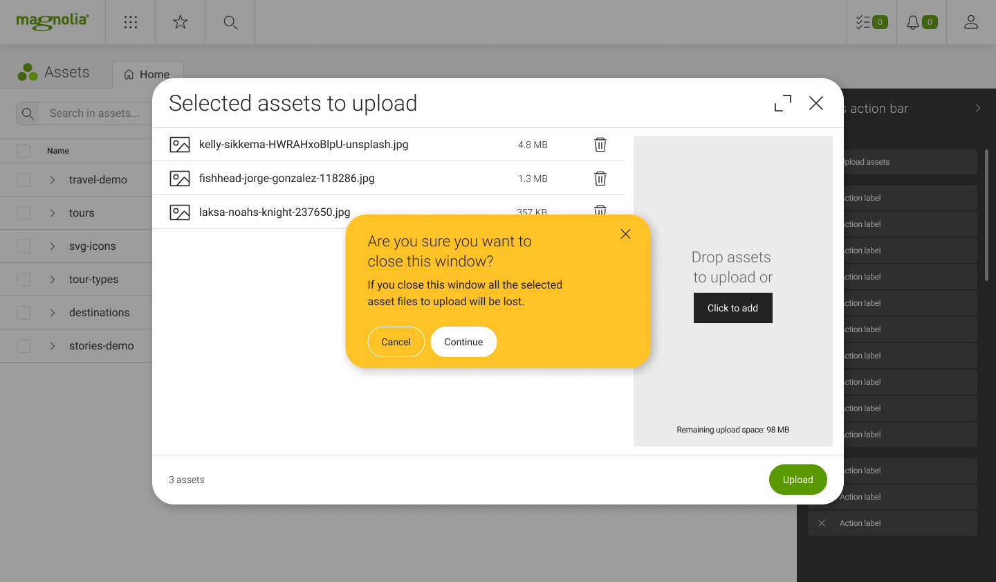
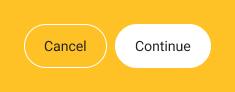
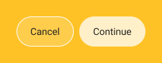
Fix the color contrast of the clickable button of the yellow messages globally, as it's currently not meeting the minimum accessibility standards and it's hard to read
- Change properties to Figma Properties
- Change color contrast for all the statuses of the buttons
- Default
- Hover
Note. The task is marked as docu required, in case we need to update screenshots
Acceptance criteria